GABC Notation
Table of contents
Advanced notation
Liquescentiae and initio debilis figures
Rhythm signs
Flats and naturals
Spaces
Determination of the neume according to the sequence of notes
Optional characters and repetitions
Advanced details
The podatus
Empty notes and accents
Polyphony
Ends of line
Custos
Translation
Text above notes
Choral signs
Comments
Elision
Insert code (for advanced users)
Braces above notes
Conclusion and extensions
Complete example
Advanced notation
Liquescentiae and initio debilis figures
The notation of an initio debilis is simple: you simply add a hyphen ( - ) before the note to be affected.
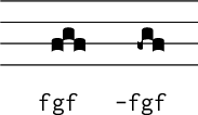
Torculus and torculus initio debilis
For liquescentiae, three types exist, which are indicated by a character at the end of the neume:
- diminutive liquescentiae, indicated by
~ - increasing liquescentiae
- ascending indicated by
< - descending indicated by
>
- ascending indicated by
Liquescentiae are indicated after other characters that determine the note.
Rhythmic signs
The punctum mora (dots after the note) are denoted by adding a period ( . ) after the note. When there are two dots after a neume, the character is simply doubled: ( .. ).
The vertical episema (also called the ictus) is denoted by an apostrophe ( ' ) after the note. Gregorio will place the episema above or below the note according to the context, however you can force its position with '0 (for always below) and '1 (for always above).
Of course, the punctum mora and vertical episema can be present more than once in a neume, but only once per note.
For the horizontal episema, type an underscore ( _ ) after every note that is under an episema. Like the vertical episema, Gregorio will place the horizontal episema above or below the note according to the context, but you can force its position with _0 (for always below) and _1 (for always above).
By default, horizontal episemas on adjacent notes will automatically be bridged (joined together). The command \gresethepisema{break} will prevent this behavior, while \gresethepisema{bridge} restore it. To prevent Gregorio from attempting to bridge two episema in just a single glyph, you can use _2 .
In some cases you may want the episema to be slightly shorter than normal. This can be accomplished with _3, _4, and _5 corresponding to the short episema being aligned to the left, center, and right of the note respectively. These short episema can be combined with the normal ones (placing two horisontal episema on the same note), so long as the direction for the longer one is specified and they are not on the same side of the note. You can also prevent them from bridging to adjacent notes that also have episema with 2, allowing up to three numbers to be appended to _.
Rhythmic signs are notated after liquescentiae and other signs that determine the shape of the note. For example, a virga followed by a punctum mora is denoted hv. and not h.v, and a torculus deminutus followed by a punctum mora is denoted ghg~. .

The different signs
Alterations
Two letters have been chosen to represent the flat and the natural: x y. As these signs take the space of a note, we notate them like a note, for example, ix for a flat on the staff position represented by i.
Note that you can also type a sharp in gabc, with the character #.
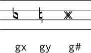
The alterations
Spaces
Spaces are very important in Gregorian chant. When monks transposed scores from ancient neumes into square notation, the equivalence was not exact, and some ancient figures have been translated by a larger space between two notes of a neume. Although this phenomenon is quite rare, it exists, and it is necessary to take it into consideration in order to preserve every detail of a work.
Five spaces are used in Gregorian chant:
- neumatic cut: within a neume, the neumatic elements are separated by this space, which is the smallest space;
- large neumatic cut: this is the space described in the paragraph above; it is used in the same way as the neumatic cut, but the space is larger;
- glyph space: this is equivalent to the size of a punctum and serves to mediate between the puncta inclinata of a climacus whose range is greater than a third
- syllabic space: the space between two neumes corresponding to two syllables of the same word
- word space: the space between two words. This space is more difficult: it is the space between both the letters and the notes of two different words. This space is also the one between words and separation bars.
The neumatic cut is denoted by a slash ( / ), and the larger neumatic space, more rare, by two slashes ( // ). A glyph space is indicated by a normal space. Syllabic and word spaces are automatically calculated by the software, according to the text, and this poses no difficulty. The glyph space is automatically included when there is a climacus with an interval of a third or greater.
While the above standard spaces should suffice for most scores, there are occasions where it is necessary to fine tune the spacing even further. For this purpose the half-space (/0) and the ability to arbitrarily scale the neumatic cut (/[factor]) are provided. The scaling factor for this last one can even be negative, allowing you to overlap the horizontal position of notes.
Besides these spaces, gabc recognizes two ways of saying "no space here". The first is the exclamation point (!) which means there should be no connection between the notes and the second is the "at" symbol (@) which connects the two notes together. This latter process is referred to as fusion and allows you to create neumes which would not otherwise be possible (especially useful for neumes with 5 or more notes).

Examples of spaces
Note that for practical reasons, a space (/ etc.) can be set unbreakable if you precede it with the exclamation point (!).
Determination of the neume according to the sequence of notes
Regarding notation, we should say first that it is not useful to specify a virga in a neume, as linking bars between notes will be automatically added when necessary. Except for virga (which can be a glyph inside another neume), bivirga or trivirga neumes, there is no place for entering a v when you type the sequence of notes of a neume.
To any sequence of notes and spaces corresponds one and only one written form. The only exception is the sequence of three or more ascending notes. To determine the written form to use in this case, we must introduce a character to prevent linking between two notes. This character is ! . It allows us to have a complete equivalence between our notation and the written form. But be aware that this sign indicates a space of zero width: it is the only "space" that can be found within a glyph.

Effects of
! on glyph determination
Optional characters and repetitions
For neumes that repeat the same note several times, it is possible to achieve faster notation. For example, for the bivirga two v are added after the note, and for the tristropha three s. The result will be the same if each detail is written: hs/hs/hs = hsss.
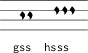
bistropha and tristropha
Advanced details
The podatus
The podatus poses a difficulty for square notation in general, because there are seven ways of denoting it in ancient notation, and much fewer in square notation. In the Solesmes hymnary of 1983, two new notations were introduced: the pesquassus and the podatus initio debilis. The first is written using an o after the first note, as it is an oriscus, and the second is written logically with a - before the first note.
A new written form of the podatus is also proposed here. It could be used to distinguish pes quadratus of the old notation that is currently transcribed in the same way that the light pes and the pes with episema are. In this new written form of the podatus, the second note is located to the right of the bar that links the two notes, and not to the left. These pes quadratus are notated by adding a q between the two notes.
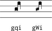
Pes quadratum and Pes quilisma quadratum
Empty notes and accents
As the empty notes and accents are quite rare, the notation to get them is not very intuitive, but is still simple: simply add the following signs after your note:
- punctum cavum (also works with a punctum inclinatum and punctum inclinatum auctus): r
- linea punctum: R
- linea punctum cavum: r0
- accentus: r1
- reversed accentus: r2
- circulus: r3
- semi-circulus: r4
- reversed semi-circulus: r5

Empty notes and accents
Polyphony
The goal of the notation presented here is to represent Gregorian chant, and thus songs in only one voice. However, the first polyphonic pieces were written in square notation, even if the current notation is slightly different, so it seemed important to consider the case of people who would want to write polyphonic scores in square notation.
Sadly the typography of polyphony on several levels of staffs is way more difficult than the normal typography, and it's not yet possible (with Gregorio or any other serious gregorian software of which we are aware). Gregorio does support a simple notation for simple polyphony on one staff line. This is possible in gabc when putting the first note of a vertically aligned group between curly brackets:
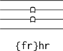
Simple polyphonic notation
As a result of the difficulty in rendering polyphony typographically, there are a few quirks with the above notation that users should be aware of:
- The notes in curly braces must go first.
- You can alternate notes in curly braces and notes outside them in the same syllable, but the curly braces are effectively a zero-width space (
!) between the notes on either side of them. If using this alternating pattern, you will need to manually space between the various groups of notes in the same syllable. - The notes in curly braces are ignored for spacing purposes; only the notes outside the curly braces count. This means if they are wider than the notes outside curly braces which immediately follow, then they may run into the next element. You'll need to add manual spaces outside the curly braces to prevent this.
- No attempt is made to avoid collisions between the two voices. It is the users responsibility to introduce manual spacing to avoid said collisions.
- At the end of the line the automatic custos will be set based on the first note in the next syllable, even if it is inside curly braces.
Since polyphony is so rare in Gregorian chant, improving the behavior of Gregorio in this area is extremely low on the list of priorities for the developers. If you find yourself using this feature and want improvements, then you are most likely going to have to make them yourself (see the contributing guide for how to get started).
End of line
The end of line is automatically determined by the GregorioTeX. However, under some circumstances it can be useful for you to specify it because it improves the rendering. To force an end of line at the end of a syllable put z inside parentheses after the notes. If you want your line to end without being justified, use Z instead.
You can also prevent a line break from occurring within a group of syllables by using the “no line break area” tags (<nlba></nlba>). The opening tag should be placed before the lyrics at the start of the group and the closing tag after the lyrics at the end of the group: <nlba>these(g) words(g) will(h) not(h) be(g) split</nlba>(g)
Custos
By default the custos (an indication of the first note on the next line) is automatically generated at each line ending within a score, whether that line ending be automatic or manually determined. By setting \greseteolcustos{manual} those custos are turned off. Further, the behavior at a manual line break (z or Z) can be specified on a case-by-case basis. Adding a + will force the custos to appear at that line break while adding a - will suppress it at that particular line break.
In some cases, it may be necessary to typeset a custos inside a line. This is the case of a clef change, for example. In this particular case, simply type z0 before the clef change to get it; its height will be calculated automatically.
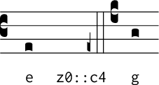
In other cases where a manual custos is required (such as at the end of a score where there is no next note for the automatic calculation), you can input it manually with g+, replacing g with the height you want.
Translation
To add a translation (or a second line of text), simply put it between square brackets in the syllable text. By default the text will be left-aligned with the text of the syllable, but you can force it to center below the syllable with \gresettranslationcentering{center}. In either case, the translation won't go to the next line automatically. Thus it may require a bit of work to get the desired effect.
It is also possible to span the centering of a translation over several syllables. To do this you enter the translation as normal on the syllabe which you want to start the centering span and enter [/] as the translation for the syllable which ends the centering span. If you do this, the multi-syllable translation will be centered over the span of syllables regardless of the setting for translation centering for an individual syllable.

Text above notes
There are two ways to add text above notes: the first is to set the text at the syllable text level between <alt> markup tags (alt is short for above lines text). This text will be left-aligned with the first note of the syllable. It is also possible to typeset text entering [alt:my text] in the notes, which will align "my text" with the next note.

Choral signs
It is possible to produce choral signs in gabc. To do so add [cs:t] after the note for which you want the sign, replacing t with the sign you desire.
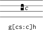
Comments
All the characters on a line after a % will be ignored.
Elision
Starting from version 4.1, syllable text in <e> markup is considered as an elision: a syllable without any associated notes which is quickly sung as part of an adjacent syllable. This text will be output in its own style (elisionstyle, italic and small by default), and will be ignored by vowel finding algorithm. For example cla<e>ra</e>(gh) gives:

Insert code (for advanced users)
It is possible to insert verbatim code in gabc, this code will appear as it is in the TeX file. You can do this at several levels. First, you can insert text between the <v> markups in the syllable text.
Verbatim code can also be inserted at three levels in the notes:
- at note level, not modifying the glyph determination, with
[nv:\mycode]after the note, replacing\mycodewith the code you want to insert - at glyph level, forcing the glyph to stop but staying in the same element, with
[gv:\mycode] - at element level, forcing the element to stop and not automatically adding a neumatic space (which you may have to add by hand), with
[ev:\mycode]
Note that macros can be defined. Let's take an example: add this in your header:
def-m1:\mycode;
You can now call this macro in your notes using the notation [nm1], [gm1] or [em1]. You can define 10 macros this way (from 0 to 9).
Braces above notes
You can create braces above notes in two ways. The following syntax will create a brace of fixed width: [ob:1;6mm] where
orepresents position of the brace.ois over the staff,uis under the staff.brepresents the shape of the brace: a round brace (b), a curly brace (cb) or a curly brace with accent (cba). Only the round brace (b) works with the understaff position (u).1is the attachment point of the brace: the left side (1) or the right side (0) of the note immediately before the brace code6mmis the length of the brace
On the other hand you can also use a syntax which allows you to specify the left ([ob:0{]) and right ([ob:0}]) extents of the brace in the notes. This syntax recognizes all possible values for position (o or u), shape (b, cb, or cba), and attachment point (0 or 1) of the brace as the fixed width brace. Additionally, while the position and shape needs to be the same for both ends of the brace, you need not specify the same attachment point for the right and left extents (e.g. you can start the brace on the left side of one note and end it on the right side of another).
When using the dynamically sized braces, you will need to compile your document twice in order to get the braces to be the right size. The first will draw the brace at its minimal size (about the width of a punctum), but will also calculate the correct positions for the start and end points and store that information for the subsequent run. The second pass will make use of the stored information to draw the brace at the correct width. Note that in order for this to work, there can be no changes to the score between the two passes.
By default braces are rendered using MetaPost. This allows the line weight to remain more consistent when braces are stretched. You can also render the braces using score font (the behavior in versions 3.0.3 and earlier) by calling \gresetbracerendering{font}.

Conclusion and extensions
Some very advanced features of gabc are documented in GregorioRef-###.pdf (where ### is the version number), please take a look if you cannot find what you need.
If some aspects have been overlooked or if a new written form should appear, many ASCII characters have not yet been used in our notation and remain available, for example, the letters n, p, t and u, both upper- and lower-case.
If you think gabc lacks a feature or see a bug, please report on the issue tracker.
The representation of ancient notation is currently in development. Please see GregorioNabcRef-###.pdf (where ### is the version number) for an explanation of the notation as it has been implemented thus far.
A complete example
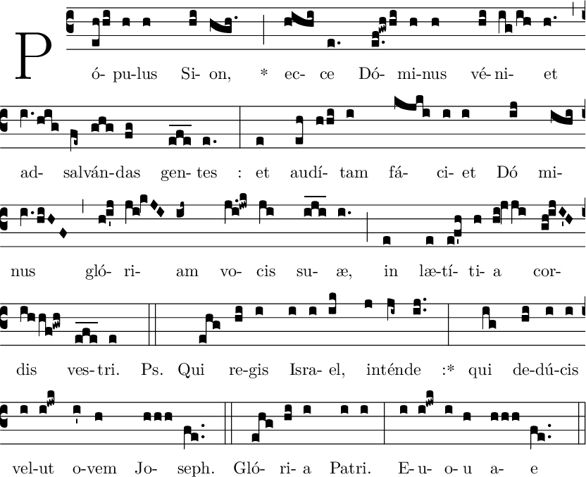
name: Populus Sion;%%(c3) Pó(eh/hi)pu(h)lus(h) Si(hi)on,(hgh.) *(;) ec(hihi)ce(e.) Dó(e.f!gwh/hi)mi(h)nus(h) vé(hi)ni(ig/ih)et(h.) (,)ad(IV./hig)sal(fe~)ván(ghg)das(fg) gen(e_f_e_)tes(e.) :(:) et(e) au(eh)dí(h/hi)tam(i) fá(kjki)ci(i)et(i) Dó(ij)mi(ihi)nus(IV./hiHF) (,) gló(h!i'j)ri(ji!KVJI)am(ij~) vo(j.i!jwk)cis(ji) su(i_j_i_)æ,(i.) (;) in(e) læ(e)tí(e!f'h)ti(h)a(hi!JVji)cor(gh!ijI'H)dis(ihhf!gwh) ves(e_f_e_)tri.(e) <i>Ps.</i>(::) Qui(ehg) re(hi)gis(i) I(i)sra(i)el,(ik) in(j)tén(ji~)de(ij..) :*(:)qui(ig) de(hi)dú(i)cis(i) vel(i)ut(i!jwk) o(i')vem(h) Jo(hhh)seph.(fe..) (::) Gló(ehg)ri(hi)a(i) Pa(i)tri.(i) (:)E(i)u(i!jwk)o(i)u(h) a(hhh)e(fe..) (::)
